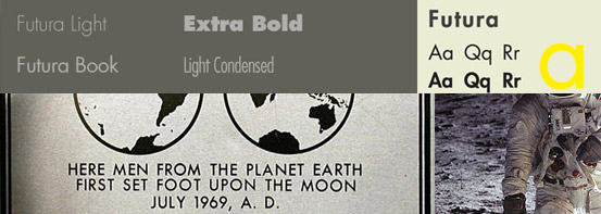
A great article by idsgn as part of a series “know your type” which gives a great insight into some of the most influential but understated typefaces around. I really enjoyed idea of Future being the first font on the moon, while it is also odd to see IKEA drop it in favour of Verdana!
Know Your Type series: DIN / Verlag / Future / Gotham / Clarendon